I'm tremendously grateful for the experience and plan on continuing it for many more years, but for now let's focus on what has come before, not what lies ahead. In the past 365 days, 259 posts have escaped this keyboard (making this the 260th post - another, slightly less major, milestone). Some were long, some were short, most were fixated on shirtless men.
In that time I have reviewed 215 movies. Some were harder to write about than others. Some (mostly the bad movies) flowed out of my fingertips like rain. What I'm saying is I wrote a lot. Be proud of me, dangit.
(Sidebar: In one of those random fits of serendipity the universe throws from time to time, my new blog friend Hunter Allen's own movie review site, Kinemalogue, also had its first birthday today. Please go check it out and congratulate him, he's a cool dude.)
So - to celebrate this momentous occasion I have decided to do what I do best - make a list. Because the traditional first anniversary gift is paper, I will stick along with that theme for
THE TOP TEN HORROR MOVIE POSTERS
#10 Visiting Hours (1982)

There's just so much going on in this poster. Perhaps it's not the best in the world (I mean, obviously. It's at number 10.), but every element works together to paint a picture of what is hopefully a great slasher movie (I haven't actually seen it yet. Census Bloodbath is still stuck in 1980, so there's a couple years left to go.). There's the hospital itself with its genre typical skull design, there's the delighfully cheesy tagline, and there's the subtler RX symbol in the title, all working in tandem to promote the film's pure slashitude. Canadian slashers are just so cool, you guys.
#9 It's Alive (1974)

#8 The Thing (1982)

This poster doesn't get top billing for me because I prefer the alternate tagline ("Man is the warmest place to hide."), but this design is still chilly and mysterious, perfect for the grim cold world of John Carpenter's special effects masterpiece.
#7 The Evil Dead (1981)

The Evil Dead poster is a success for accurately depicting what it's like to watch the film. Sam Raimi's magnum opus grabs you by the throat and never lets go, but the classy poster design betrays the amount of forethought that went into this frenetic terror extravaganza despite the low budget.
#6 The Texas Chain Saw Massacre (1974)

Remember back when I was talking about unforgettable 70's taglines? Between this, It's Alive, and Black Christmas ("If this picture doesn't make your skin crawl... it's on TOO TIGHT.") it's a wonder anybody survived 1974 at all.
#5 Silent Night, Deadly Night (1984)

Ah, the poster that fueled a thousand moral outcries. Parents were incensed that a beloved childhood figure was being turned into a murderous lunatic, ignoring that 1) it had been done twice before already in To All a Goodnight and Christmas Evil and 2) Santa's not actually the killer. It helps to watch the movies you're denouncing. Anyway, if a poster's image is that powerful, you know you've done something right.
#4 The Descent (2005)

The Descent is already one of the scariest movies of the decade without the help of this chilling poster, bringing a classic Dalí piece into the modern age.
#3 The Cabin in the Woods (2012)

Honestly, this movie was great but it wasn't my favorite for several reasons. Reasons you will certainly get should I ever get the chance to review it anytime soon. But that poster is a work of genius, the Rubik's Cube style cabin providing both an excellent artistic touch and a hint as to the underlying themes of the film, all with a sleek and simple, yet breathtaking design.
#2 Scream 4 (2011)

#1 Halloween (1978)

And hey, this is a special occassion. As a bonus, just for you, I'm going to throw in
THE FIVE WORST HORROR MOVIE POSTERS
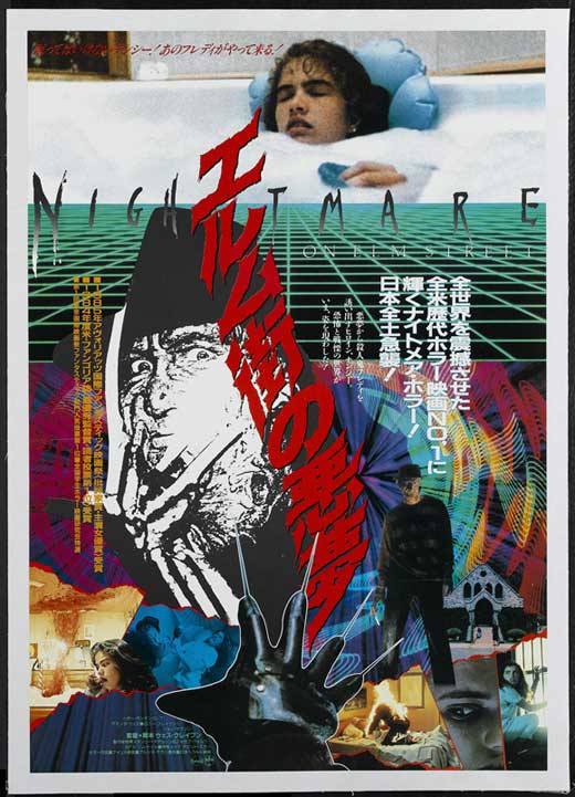
#5 A Nightmare on Elm Street (1984)

I love this film more than I love most things, and I have spent hours trying to convince myself that this poster is worth hanging on my wall. But come on! Look at that bizarre pursed lip/empty stare expression that looks like "Nancy" is trying to unsuccessfully blow a bubble with that utterly bizarre kitchen knife Krueger, looking more like a desiccated skull erupting from her pillow. It's just a mess is what it is, although it's nothing compared to the lunacy of the Japanese one sheet.
#4 The Descent: Part 2 (2009)

No, it doesn't help that this was a terrible sequel to one of the best horror films ever made. But the red on red motif is needlessly confusing to the eye and it's a helpless bastardization of two of the best moments in the original film. And that tagline is utter nonsense, although at this point I'm just taking potshots. The movie has been maligned enough, I suppose, including by me.
#3 To All A Goodnight (1980)

It's incredible that this poster can be so incredibly lazy and overwrought, yet still be better than the film itself. Unfortunately, To All a Goodnight is not about a snake man that comes down from the sky, making this both a bad design and a bad advertisement, a two for one deal that kills any hope anyone might have for the movie in the first place.
#2 Scream 4 (2011)

I mean, seriously? Scream 4 has one of the best posters of all time and the secondary design is this hunk of crap? If I want a poorly CGI'd Ghostface mask gawking at me, I'll go watch a fan animation. This is real life, people. The Scream franchise is notorious for terrible posters and I'd hoped that the utterly perfect Ghostface/Knife design showed that they learned from their mistakes or at least got a new marketing team. Evidently not, and it shames me to think that perhaps the masterpiece level work of my number two poster was just a fluke. So, not only just a bad poster design, one that singlehandedly ruins another, stellar, design. You're better off never releasing a poster at all!
#1 The Hills Have Eyes Part 2 (1984)

I've been mean enough to Wes Craven posters on here, so I won't take too much time out on The Hills Have Eyes Part 2, because in all honesty nobody else did. The film is mostly just stock footage from the first film combined with people talking about how they remember what happened last time, like some twisted sitcom flashback episode. A lazy poster for a lazy movie. This is the ugliest side of horror filmmaking in the 1980's, which is something I usually tend to enjoy. Not here.
#4 The Descent: Part 2 (2009)
No, it doesn't help that this was a terrible sequel to one of the best horror films ever made. But the red on red motif is needlessly confusing to the eye and it's a helpless bastardization of two of the best moments in the original film. And that tagline is utter nonsense, although at this point I'm just taking potshots. The movie has been maligned enough, I suppose, including by me.
#3 To All A Goodnight (1980)
It's incredible that this poster can be so incredibly lazy and overwrought, yet still be better than the film itself. Unfortunately, To All a Goodnight is not about a snake man that comes down from the sky, making this both a bad design and a bad advertisement, a two for one deal that kills any hope anyone might have for the movie in the first place.
#2 Scream 4 (2011)
I mean, seriously? Scream 4 has one of the best posters of all time and the secondary design is this hunk of crap? If I want a poorly CGI'd Ghostface mask gawking at me, I'll go watch a fan animation. This is real life, people. The Scream franchise is notorious for terrible posters and I'd hoped that the utterly perfect Ghostface/Knife design showed that they learned from their mistakes or at least got a new marketing team. Evidently not, and it shames me to think that perhaps the masterpiece level work of my number two poster was just a fluke. So, not only just a bad poster design, one that singlehandedly ruins another, stellar, design. You're better off never releasing a poster at all!
#1 The Hills Have Eyes Part 2 (1984)
I've been mean enough to Wes Craven posters on here, so I won't take too much time out on The Hills Have Eyes Part 2, because in all honesty nobody else did. The film is mostly just stock footage from the first film combined with people talking about how they remember what happened last time, like some twisted sitcom flashback episode. A lazy poster for a lazy movie. This is the ugliest side of horror filmmaking in the 1980's, which is something I usually tend to enjoy. Not here.
Word Count: 1424
Bon anniversaire for both of us!
ReplyDeleteI kind of like the Nightmare poster, despite the, let's say, idiosyncratic attempt at portraiture. It's still got that odd, pulp quality that so many 80s posters did. Heck, up through Dream Child, all of them have at least one really rad poster.
Perhaps I was a little unfair toward it, but I can really never get myself to mesh with the Nightmare poster on the level I feel like I should.
ReplyDelete