Showing posts with label Anniversaries. Show all posts

Friday, June 12, 2015

How The Time Flies

Well hello there, dear readers! Today is a very special day. Two years ago today, Popcorn Culture was born! In one of those serendipitous twists of fate that only seem to happen in movies but leak out into real life sometimes, this is also the blog birthday of my good friend Hunter over at Kinemalogue. You should give him a visit. Consider it making up for the fact that you didn't buy me a gift.

Since the traditional second anniversary gift is cotton for some reason, our celebratory list for today will be:

The Top Ten Horror Movie Costumes

#10 Tippi Hedren's Green Pantsuit in The Birds


My undying love for The Birds has earned me no horror awards. Yet. But my passion continues, a roaring, crackling flame. This green outfit has perhaps not aged as well as it could have, but it's intrinsically tied in with her character, a complex, bored society women who suddenly finds herself trapped inside the worst hell nature can offer. It's thematic, it's brilliant, and she looks fantastic. What more is there to say?

#9 Daniel Radcliffe's Leather Jacket in Horns


I love love love this outfit, which highlights everything that isn't Harry Potter about Daniel Radcliffe. It's slick, it's cool, and it's street fashion at its highest degree. If I had a wish list for blog readers to send me things, this outfit would be at the top. Hint, hint.

#8 Hugh Keays-Byrne's Plastic Breathing Apparatus/Face Mask in Mad Max: Fury Road


OK, so this isn't technically a horror film. But screw that, it's my blog birthday. Immortan Joe's iconic costume, much like Darth Vader's, is functional rather than fashionable: It's a suit designed to keep the pale, ill, irradiated despot alive. The plastic body armor is hooked to a breathing apparatus that looms fleshily over his back, feeding oxygen into his mouth via that terrifying Donnie Darko face mask. It's remarkably stunning costume design, and I'm not likely to forget it anytime soon. Or ever. In my life.

#7 Dennis Christopher's Dracula Makeup in Fade to Black
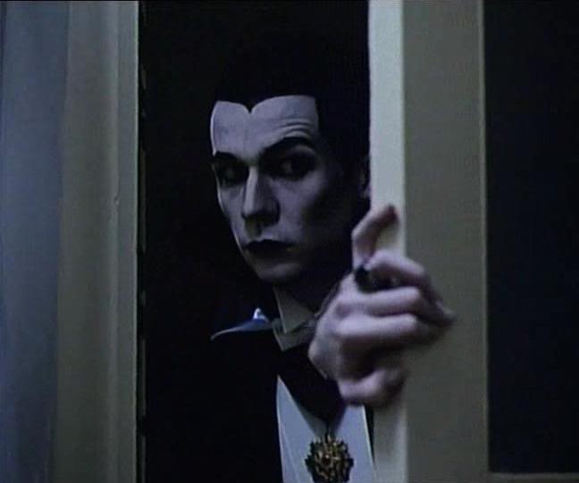

I didn't care much for this movie with its moppish Final Girl and uncharismatic, deeply strange lead, but this outfit is superb. The killings in this movie are themed to imitate classic films, and none of the various incarnations of Eric Binford rival the majesty that is this glorious make-up job, which more or less perfectly turns reality into a black and white film for a few blissful moments. Then a hooker gets impaled on a fencepost. That's slasher movies for ya.

#6 Tim Curry's Sweet Transvestite Lingerie in The Rocky Horror Picture Show


This is the outfit that earned Rocky Horror the longest theatrical run of any movie in the annals of space and time. Cobbled together from a low budget consortium of lingerie, this indelible outfit changed the face of cinema history. And damn, does Tim Curry pull it off.

#5 The Killer's Dancing Bear Costume in Girls Nite Out


This costume is high camp at its finest. Combining a silly, colorful design with a genuinely terrifying weapon (the steak knife claws sheathed in his big fluffy paws), the Dancing Bear is a perfect ironic Killer for a thoroughly weird and delightful slasher.

#4 Johnny Depp's Crop Top in A Nightmare on Elm Street


Do I even need to explain myself here?

#3 Béatrice Dalle's Black Dress in Inside


Inside is one of the classic films of the French Extremist genre, combining over-the-top gore with a heretofore unknown artistry and class. The black dress encapsulates that tone to a T, swirling with the violent, chaotic motion of its owner, swooping like the Angel of Death without ever diminishing its beauty.

#2 Bruce Campbell's Torn Shirt and Chainsaw Ensemble in Army of Darkness


I can't say I'm a huge fan of the more action-oriented third Evil Dead movie, but nevertheless this costume is the perfect complement to its loopy tone. Bruce Campbell has never looked better than as the besieged badass whose hardened, indescribably cool appearance provides a stark contrast to his Stooge-like antics.

#1 Kane Hodder's Waterlogged Jumpsuit in Friday the 13th Part VII: The New Blood


You can tell this movie was directed by a special effects guy. This glistening costume lovingly displays Jason's riddled corpse to its best effect. With a slimy bit of spine poking out the back and the battered, lake-worn hockey mask sitting atop it like a trophy, no Jason has ever been more lovingly detailed and disgusting. Combined with Kane Hodder hulking appearance and series-best performance, it creates one of the scariest killers of modern time. Too bad the movie still sucks, but I take what I can get.


The Bottom Five Horror Movie Costumes

#5 Kiefer Sutherland's Bleached Mullet in The Lost Boys


Maybe "worst" is a strong word. I absolutely adore this blonde abomination, but let's be honest. This hairstyle should be locked in a safe an submerged in the Mariana Trench.

#4 Barbara Cupisti's Hooker Wig in StageFright: Aquarius


Just like about everything else in StageFright (including the spectacular, atrocious sax-riddled score), this outfit goes above and beyond in its attempt to rival the already screechingly 80's fashions of other, lesser horror films.

#3 Everyone's Lingerie in Sorority House Massacre II


If my whole movie was going to be about busty girls in their skivvies, I think I'd want to invest in something sexier than a formless one piece and a Dora the Explorer wig.

#2 Beth Gondek's Hyper-perm in Hello Mary Lou: Prom Night II


This costume has to be a joke, right? Somewhere down the pipeline, you're telling me no actor, hairstylist, production designer, director, producer, or local deity stopped to think "Hmm, maybe this won't age well?"

#1 Gary Oldman's Mickey Mouse Wig in Bram Stoker's Dracula


Here we are. The creme de la creme. The strong suit of Bram Stoker's Dracula is its hyperbolic, gaudy stylization, but this costume is where the film oversteps its boundaries. It's like what Baz Luhrmann sees when he presses on his eyes too hard.


So there we go. Another year down, another glorious year of slicing and dicing to come. If you've been here since the very beginning, I bow down to your commitment. If you've come more recently than that, welcome! Thank you for reading and, by doing so, encouraging me to keep pursuing my relentless, daunting movie reviewing goals. Now if I could only get someone to pay me.
Word Count: 1078

Friday, August 8, 2014

Three Hundreth Time's A Charm

My birthday isn't the only celebration we're having around here. You see, today marks my 300th post since I started this blog last June! It's been a great joy to keep up this blog and I'm frankly astonished that I've made it this far without my brain exploding.

It's times like these that we begin to get self-reflective. And I've been thinking a lot about the things that make me happy. Of course Popcorn Culture is one of those things. But I want to take this chance to brag (whatever, I earned it) about a long-lost art I have enjoyed harnessing over these past 299 entries - punny post titles.

I spend a lot of time trying to come up with thematically relevant titles for my reviews and I'd like to share with you a few of my favorites. Maybe it will open your mind to the mechanics of my brain behind the scenes. Maybe you'll gain some insight into how a bored film student operates. Or maybe you'll just learn how to appreciate all the hard work I put into these puns.

So much hard work. It's all for you. Anyway.

Brennan's 10 Best Blog Post Titles (So Far)

#10 Modern Vampire Of The City (Fright Night, 2011)


Yeah, this whole post is just gonna be me explaining jokes and going "Eh? Eh?" I do not apologize. I'm particularly proud of this one because it captured both the essence of the remake (a modern vampire - and a location change to the city of Las Vegas) and was a reference to the new VAMPIRE Weekend album. Ha ha, I'm so cool.

#9 Terror On The Landline (Scream, 1996)


This one doesn't get a high-up spot because the pun is based on Terror on the Airline, a not so great period in history. So I apologize for that. But by adding a retro 90's spin on it, I feel like a get a pass, right? No. I apologize.

#8 How Am I Gonna Be An Optimist About This? (Pompeii, 2014)


Bastille references always go for the gold. This one was almost too easy, especially because the movie was crap.

#7 Census Bloodbath: It Ain't Easy Being Forest Green (Friday the 13th Part VI: Jason Lives, 1986)


This one is more of an inside joke, I suppose. The renaming of Camp Crystal Lake to Forest Green is something that really struck me and Cassidy so I inevitably associate that movie with that phrase more than the average person. But I still think that title is stellar, especially considering that renaming the camp didn't stop Jason from getting all machete-happy on the new counselors.

#6 OK, OK, OK (The Fault in Our Stars, 2014)


Oh, filled with sardonic wit I am. This was my take on the 'classic' piece of dialogue "OK? OK." I didn't hate the movie, not by a long shot. But it did feel overbearingly YA at times, resulting in this title.

#5 American Godz (Godzilla, 2014)


Ha ha. ...Get it? Cuz it's the American... Remake... GODZ. OK, well I think I'm funny.

#4
CinemaBeach: Bye Bye, Bayou (Hatchet III, 2013)


I just think that anybody who manages to work 'N Sync lyrics into any written piece in the 2010's is a superstar.

(Friday the 13th: A New Beginning, 1985)


I swear, there was something in the water this Friday the 13th. Because I am quite enamored with both of the titles for the films I watched that day. This one is a reworking of the classic line from the finale of Scream, and totally appropriate for the place the series was at the time.

#2 Best Picture Roundup: Siri Not Siri (Her, 2013)


It's always a gamble using internet lingo with a diverse audience, especially a phrase as short-lived as #sorrynotsorry, but how could I resist? And I felt my title reflected the ambiguity of the film pretty well on top of being some great punsmithing.

#1 Bella Donna (Prom Night, 2008)


Oooh, and this is where my claws come out. I hated hated hated this film. So while this title is a reference to the beauty (Bella) of the title character (Donna), it's also a reference to belladonna, a poisonous nightshade. I feel it accurately describes everything this film did to me.


Thanks for sticking around! Let's hope for 300 more!
Word Count: 738

Thursday, June 12, 2014

My, How The Time Flies When You're Ranting About Gender Representation In Slasher Films

One year ago today I started Popcorn Culture in its current form. Before that, I had a Tumblr blog that I updated in spurts and starts and a Wordpress site that vanished into the ether along with an old relationship. But Popcorn Culture is where my movie reviewing began in earnest and I really started to push myself to become a better writer and a more analytical movie watcher.

I'm tremendously grateful for the experience and plan on continuing it for many more years, but for now let's focus on what has come before, not what lies ahead. In the past 365 days, 259 posts have escaped this keyboard (making this the 260th post - another, slightly less major, milestone). Some were long, some were short, most were fixated on shirtless men.

In that time I have reviewed 215 movies. Some were harder to write about than others. Some (mostly the bad movies) flowed out of my fingertips like rain. What I'm saying is I wrote a lot. Be proud of me, dangit.

(Sidebar: In one of those random fits of serendipity the universe throws from time to time, my new blog friend Hunter Allen's own movie review site, Kinemalogue, also had its first birthday today. Please go check it out and congratulate him, he's a cool dude.)

So - to celebrate this momentous occasion I have decided to do what I do best - make a list. Because the traditional first anniversary gift is paper, I will stick along with that theme for

THE TOP TEN HORROR MOVIE POSTERS

#10 Visiting Hours (1982)


There's just so much going on in this poster. Perhaps it's not the best in the world (I mean, obviously. It's at number 10.), but every element works together to paint a picture of what is hopefully a great slasher movie (I haven't actually seen it yet. Census Bloodbath is still stuck in 1980, so there's a couple years left to go.). There's the hospital itself with its genre typical skull design, there's the delighfully cheesy tagline, and there's the subtler RX symbol in the title, all working in tandem to promote the film's pure slashitude. Canadian slashers are just so cool, you guys.

#9 It's Alive (1974)


There are enough evil infant movies to make a baby carriage on a poster instantly scary and It's Alive knows it, opting not to include anything other than negative space in the image outside of the subject. And then there's that tagline, cleverly incorporating the film's title and creating one of those uniquely 70's shlock horror slogans that will stick with you wherever you go.

#8 The Thing (1982)


This poster doesn't get top billing for me because I prefer the alternate tagline ("Man is the warmest place to hide."), but this design is still chilly and mysterious, perfect for the grim cold world of John Carpenter's special effects masterpiece.

#7 The Evil Dead (1981)


The Evil Dead poster is a success for accurately depicting what it's like to watch the film. Sam Raimi's magnum opus grabs you by the throat and never lets go, but the classy poster design betrays the amount of forethought that went into this frenetic terror extravaganza despite the low budget.

#6 The Texas Chain Saw Massacre (1974)


Remember back when I was talking about unforgettable 70's taglines? Between this, It's Alive, and Black Christmas ("If this picture doesn't make your skin crawl... it's on TOO TIGHT.") it's a wonder anybody survived 1974 at all.

#5 Silent Night, Deadly Night (1984)


Ah, the poster that fueled a thousand moral outcries. Parents were incensed that a beloved childhood figure was being turned into a murderous lunatic, ignoring that 1) it had been done twice before already in To All a Goodnight and Christmas Evil and 2) Santa's not actually the killer. It helps to watch the movies you're denouncing. Anyway, if a poster's image is that powerful, you know you've done something right.

#4 The Descent (2005)


The Descent is already one of the scariest movies of the decade without the help of this chilling poster, bringing a classic DalĂ­ piece into the modern age.

#3 The Cabin in the Woods (2012)


Honestly, this movie was great but it wasn't my favorite for several reasons. Reasons you will certainly get should I ever get the chance to review it anytime soon. But that poster is a work of genius, the Rubik's Cube style cabin providing both an excellent artistic touch and a hint as to the underlying themes of the film, all with a sleek and simple, yet breathtaking design.

#2 Scream 4 (2011)


Speaking of simple yet breathtaking. This poster design is essentially the reason I am into horror movies. I wanted to see Scream 4 so I had to watch the other Scream movies first, and once I did that I had to watch all the movies they references, sending me into a horror movie watching marathon of epic proportions. All because of this elegant Ghostface/Knife design that will be etched into my brain forever. The only reason this poster isn't number one is... well you'll see,

#1 Halloween (1978)

Yeah, Scream 4 is just a really nice riff on the Halloween poster, perhaps the most perfect movie poster ever printed. If I had expanded this piece to include all genres instead of just horror, Halloween would still be crowned victorious. That effortless central image that combines claw, Halloween, and slasher motifs into one incredibly artistic visual is the perfect way to promote what is without a doubt the classiest slasher film ever released.

And hey, this is a special occassion. As a bonus, just for you, I'm going to throw in

THE FIVE WORST HORROR MOVIE POSTERS

#5 A Nightmare on Elm Street (1984)


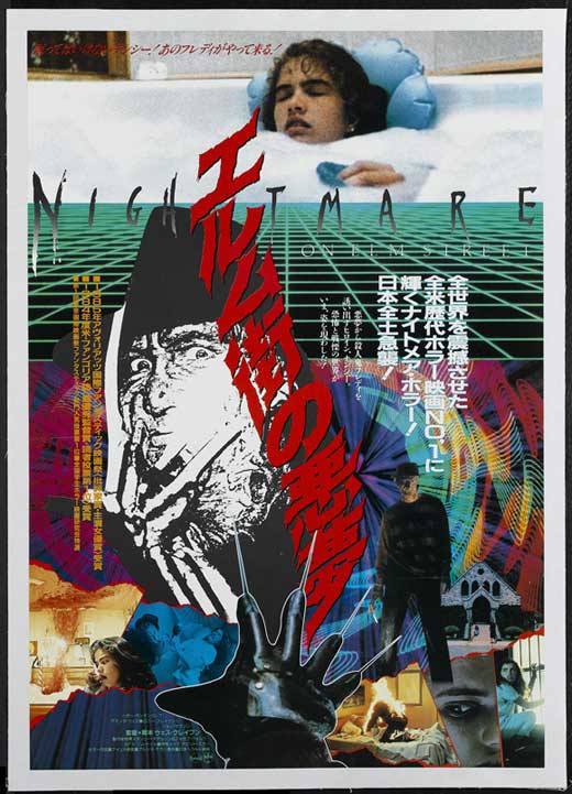
I love this film more than I love most things, and I have spent hours trying to convince myself that this poster is worth hanging on my wall. But come on! Look at that bizarre pursed lip/empty stare expression that looks like "Nancy" is trying to unsuccessfully blow a bubble with that utterly bizarre kitchen knife Krueger, looking more like a desiccated skull erupting from her pillow. It's just a mess is what it is, although it's nothing compared to the lunacy of the Japanese one sheet.

#4 The Descent: Part 2 (2009)


No, it doesn't help that this was a terrible sequel to one of the best horror films ever made. But the red on red motif is needlessly confusing to the eye and it's a helpless bastardization of two of the best moments in the original film. And that tagline is utter nonsense, although at this point I'm just taking potshots. The movie has been maligned enough, I suppose, including by me.

#3 To All A Goodnight (1980)


It's incredible that this poster can be so incredibly lazy and overwrought, yet still be better than the film itself. Unfortunately, To All a Goodnight is not about a snake man that comes down from the sky, making this both a bad design and a bad advertisement, a two for one deal that kills any hope anyone might have for the movie in the first place.

#2 Scream 4 (2011)


I mean, seriously? Scream 4 has one of the best posters of all time and the secondary design is this hunk of crap? If I want a poorly CGI'd Ghostface mask gawking at me, I'll go watch a fan animation. This is real life, people. The Scream franchise is notorious for terrible posters and I'd hoped that the utterly perfect Ghostface/Knife design showed that they learned from their mistakes or at least got a new marketing team. Evidently not, and it shames me to think that perhaps the masterpiece level work of my number two poster was just a fluke. So, not only just a bad poster design, one that singlehandedly ruins another, stellar, design. You're better off never releasing a poster at all!

#1 The Hills Have Eyes Part 2 (1984)


I've been mean enough to Wes Craven posters on here, so I won't take too much time out on The Hills Have Eyes Part 2, because in all honesty nobody else did. The film is mostly just stock footage from the first film combined with people talking about how they remember what happened last time, like some twisted sitcom flashback episode. A lazy poster for a lazy movie. This is the ugliest side of horror filmmaking in the 1980's, which is something I usually tend to enjoy. Not here.
Word Count: 1424